
DG
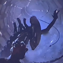
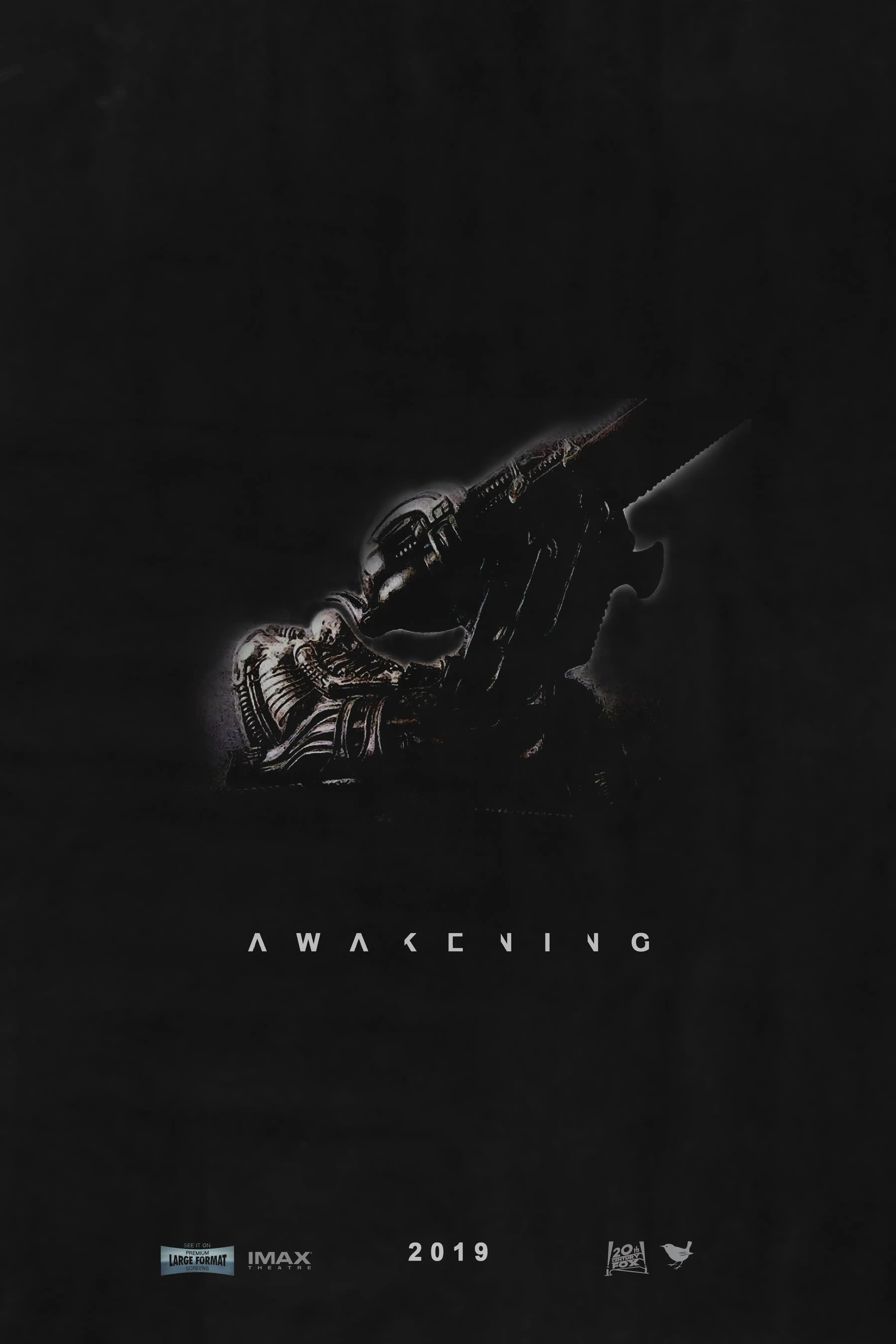
MemberOvomorphAug-15-2017 6:30 PMIt's just a teaser poster that I felt like doing since I'm always designing stuff. I saw it as a challenge to make something that would be as simple yet effective as possible because I feel like the one thing that would make even the most critical Alien fan want to see Awakening is the promise of a resolution. After all, people have been itching to see the Space Jockey since Prometheus, and the idea of the corpse sitting in that chair, alone in the dark, for who knows how long always struck a chord with me since I first saw the original film. Very haunting in its simplicity and mystery. The "less is more" approach would work for Awakening's art campaign in much the same way as Covenant's 'Run' and 'Hide' posters did, but considering how polarizing Covenant turned out to be, whoever designs the official stuff probably needs to steer away from the xenomorphs as a focal point. I figured you guys would enjoy it since not a lot of people have thought that far ahead fan poster-wise. :)

dk
MemberTrilobiteAug-15-2017 6:33 PMNicely done! I also like how the lettering looks like it is "evolving" like it does in the movies' openings. Upvoted.

Jonesy
MemberFacehuggerAug-15-2017 7:18 PMLove the poster. It gives me the vibe that Awakening should go to a horror Sci-fi direction.
dk
MemberTrilobiteAug-15-2017 7:50 PMThis poster should be re posted when AA is confirmed and the hype starts.

Barf The Mog
MemberFacehuggerAug-15-2017 9:34 PMThat poster is rad!
I like how minimal it is, very ALIEN.
Cerulean Blue
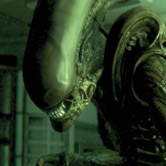
MemberFacehuggerAug-16-2017 9:01 AM@DG - I love it! The Big Guy in the chair is what started it all for me, too!!
DG
MemberOvomorphAug-16-2017 9:58 AMThank you all! I have another idea in mind that is more artsy and mirrors the relief design of the Covenant poster, but I'll have to squeeze that in between my design assignments for work. :)

Timmy the ultramorph
MemberChestbursterAug-16-2017 10:06 AMgreat work. espeicially the letters.
food ain't that bad! - Parker
Ingeniero
MemberPraetorianAug-16-2017 9:47 PMVery nice work and it fits well with what I'd love to see resolved in Alien: Awakening. Thank you.
...I don't want to wait until 2019 though.